POSTAL
MUSEUM
Augmented-reality tour app
An augmented-reality tour app that brings the Postal Museum's exhibits to life — on-site and from anywhere.
As lead UX/UI designer, I ran research, designed the flows and high-fidelity screens across mobile, desktop and the AR view, and shaped the app's visual identity.
Museum Visit
The Challenge
Traditional museum tours often leave visitors passive. Static labels and glass cases make it hard to feel close to the exhibits — or to understand the stories behind them.
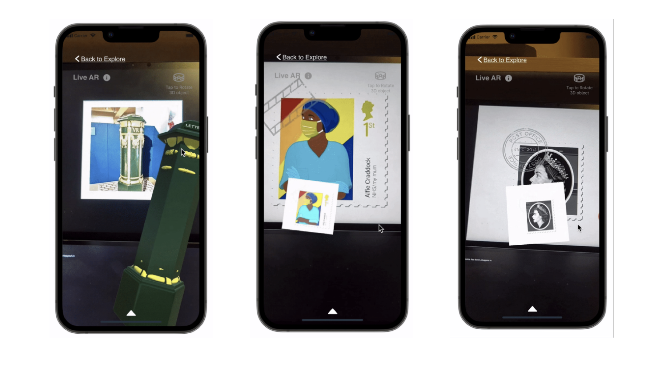
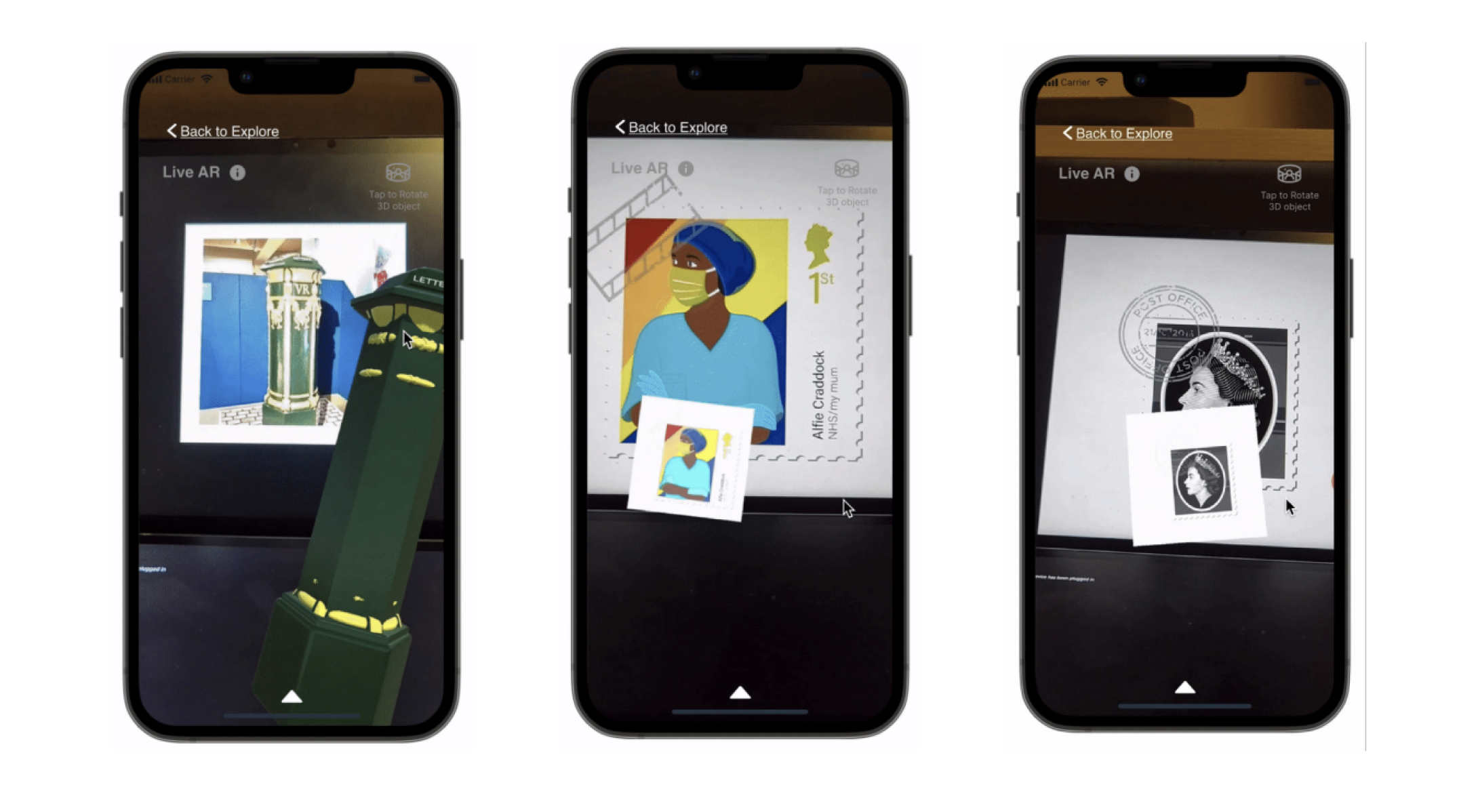
The brief: redesign the Postal Museum's tour app so a visit feels alive. I visited the museum, studied how people moved through it, and designed an AR experience that works both on-site and remotely — bringing exhibits to life with 3D models, detail and multimedia layered over the real space.
Problem
Visitors find conventional tours low on engagement — it's hard to fully appreciate the exhibits.
Solution
AR turns each exhibit into an immersive, interactive story — with 3D models, context and media, on-site or from anywhere.
My Role
Lead designer across research, UX and UI — including an in-person museum visit to ground the work.
Guiding Principles
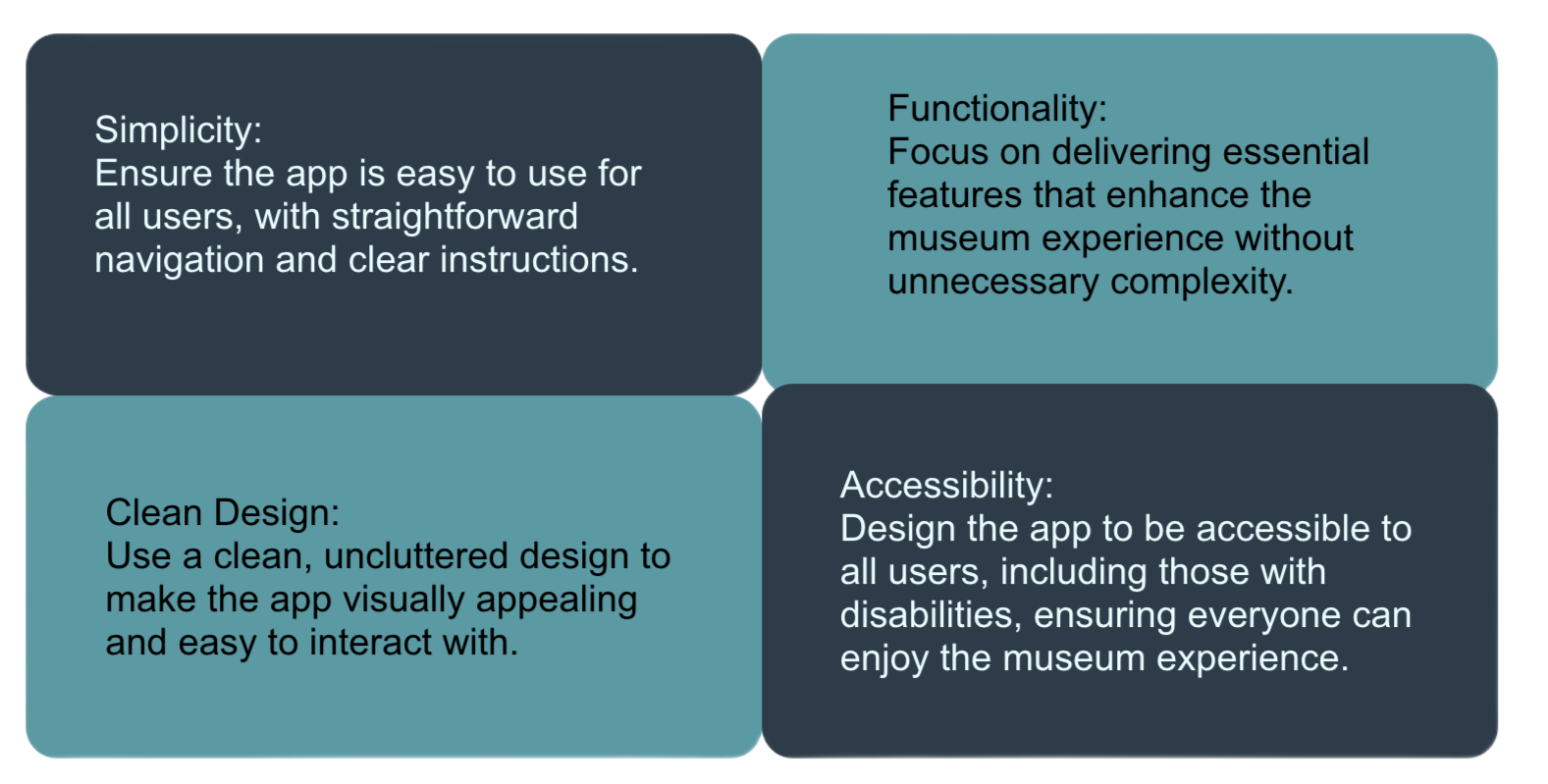
A small set of rules kept the experience focused: guided, immersive, and welcoming whether you're standing in the museum or exploring from your sofa.
The Visual System
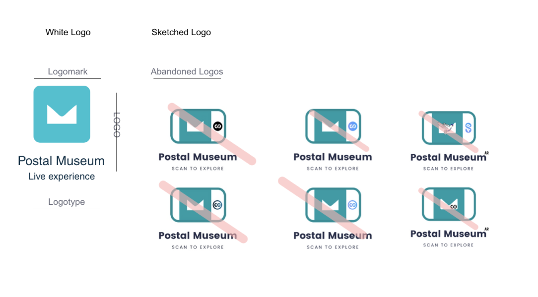
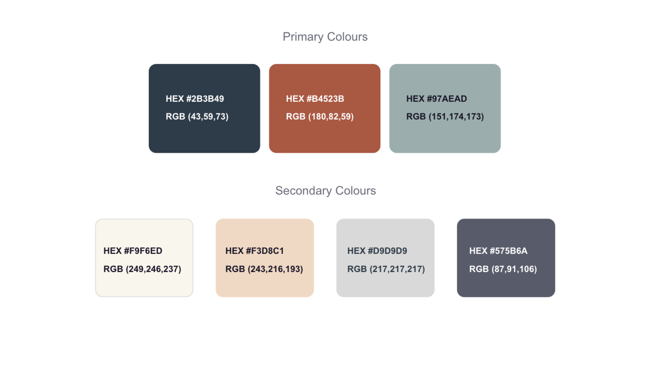
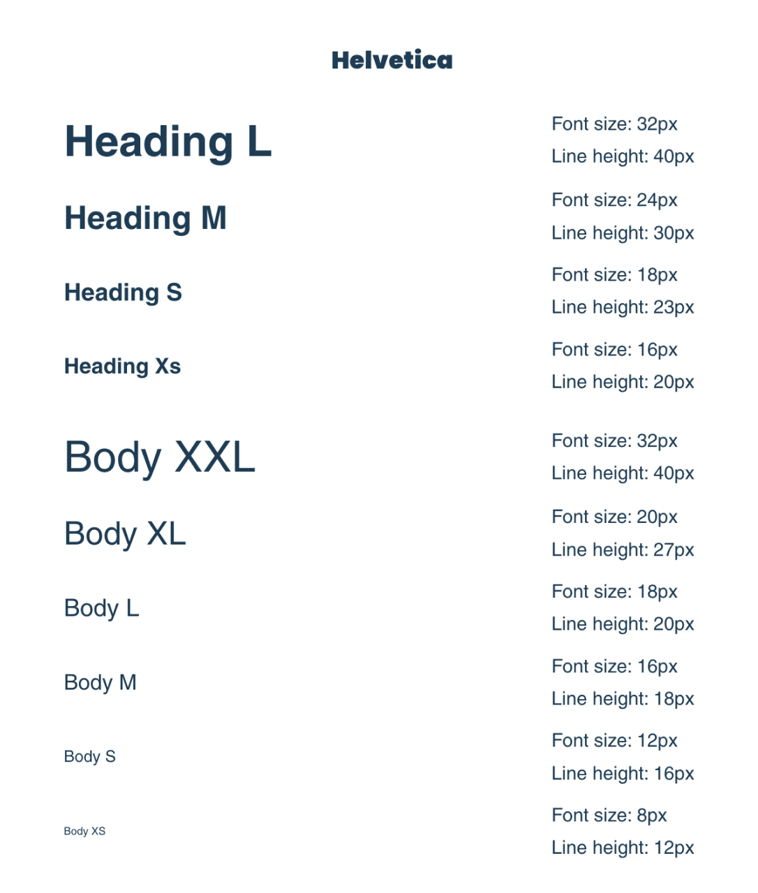
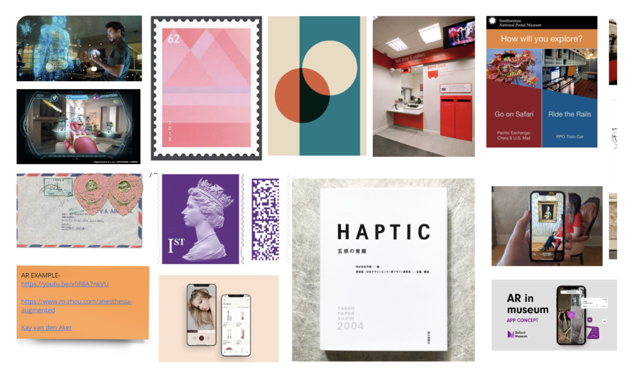
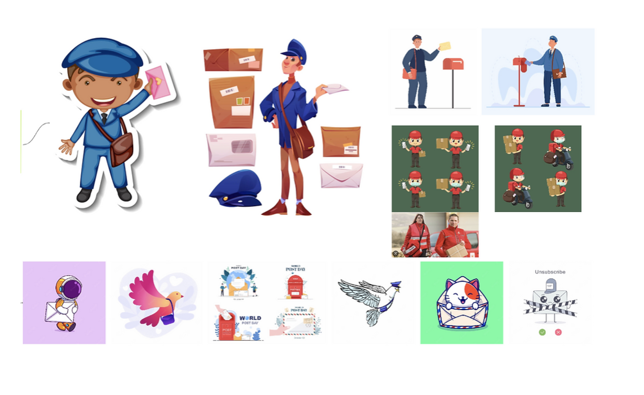
A black-and-red identity — the trust of black with the energy and history of red — gives the app a high-contrast, memorable feel. Poppins keeps it modern and legible; bright imagery on dark grounds makes exhibits pop.
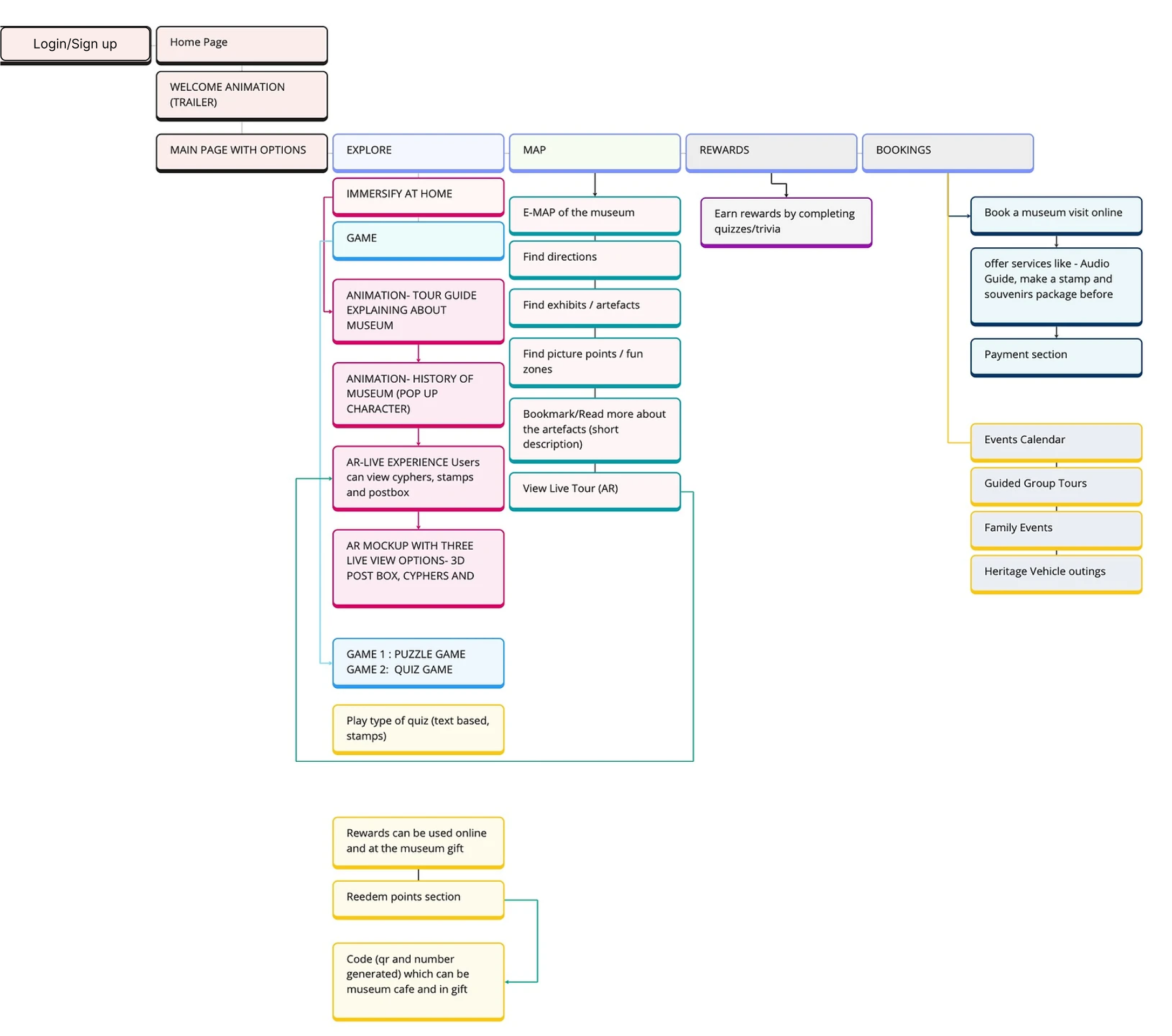
Architecture & Flow
Wireframes
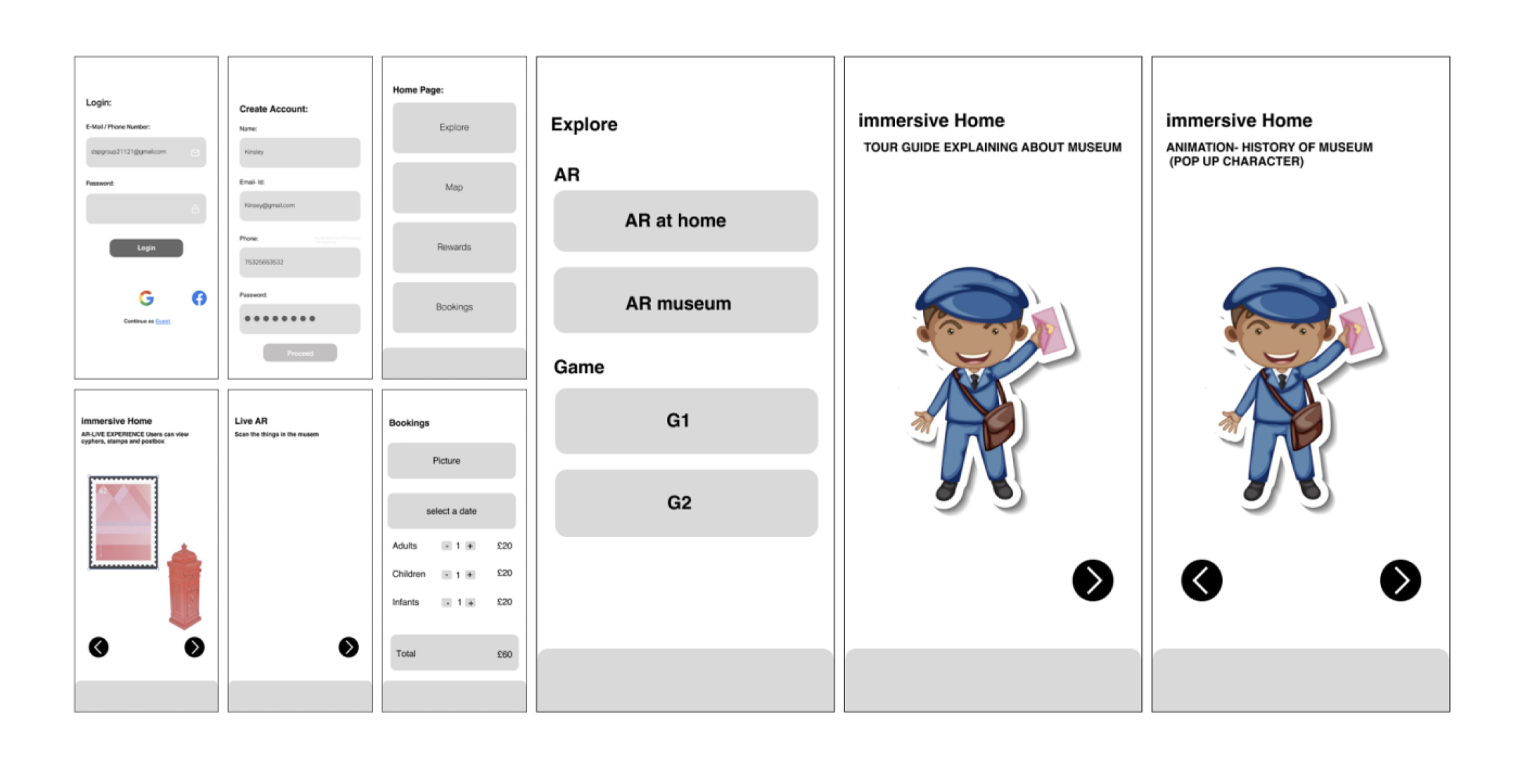
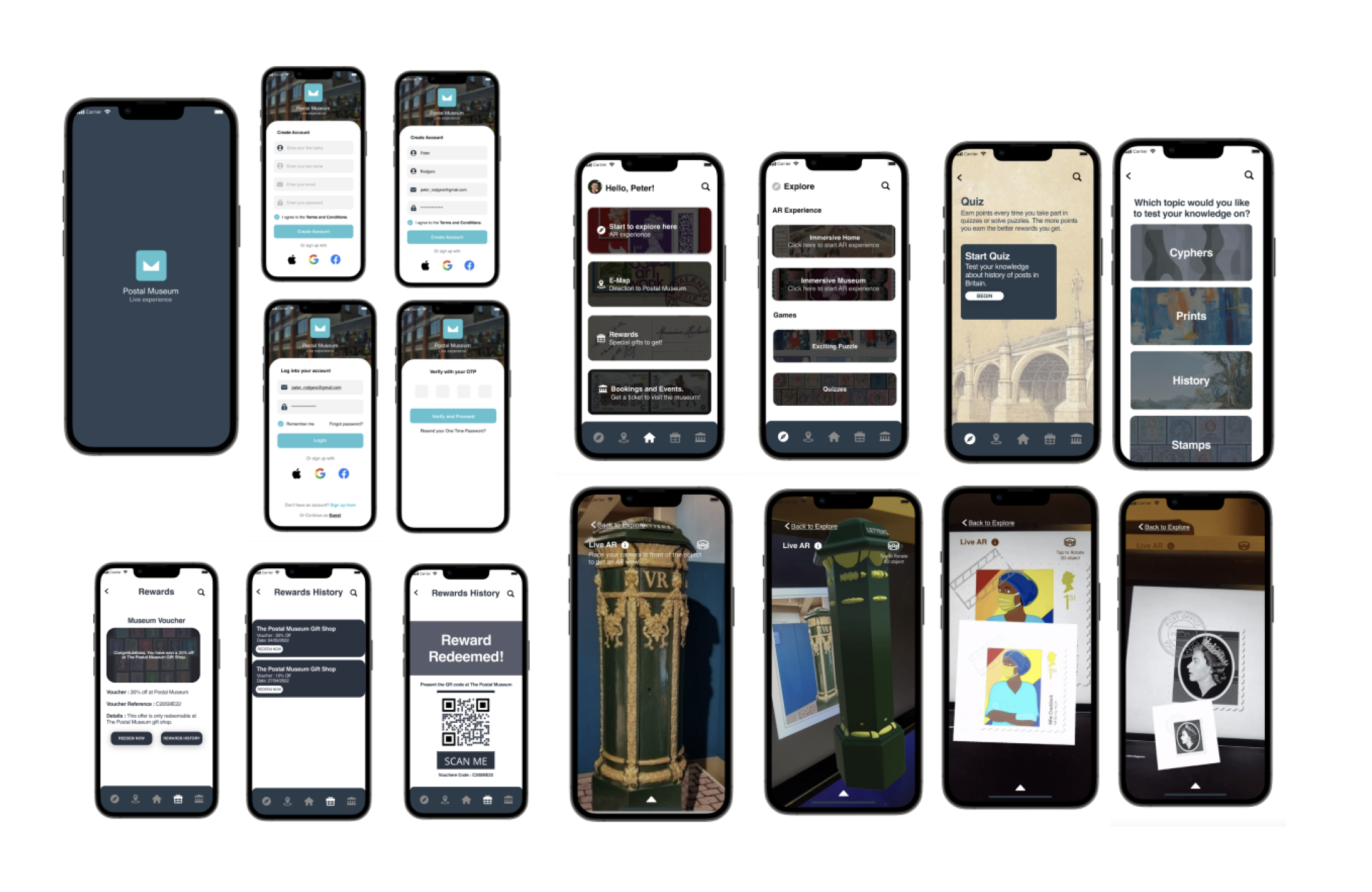
The structure gives newcomers an easy on-ramp: a splash overview, then a quick, low-friction sign-up and sign-in before the tour begins.
Usability Testing
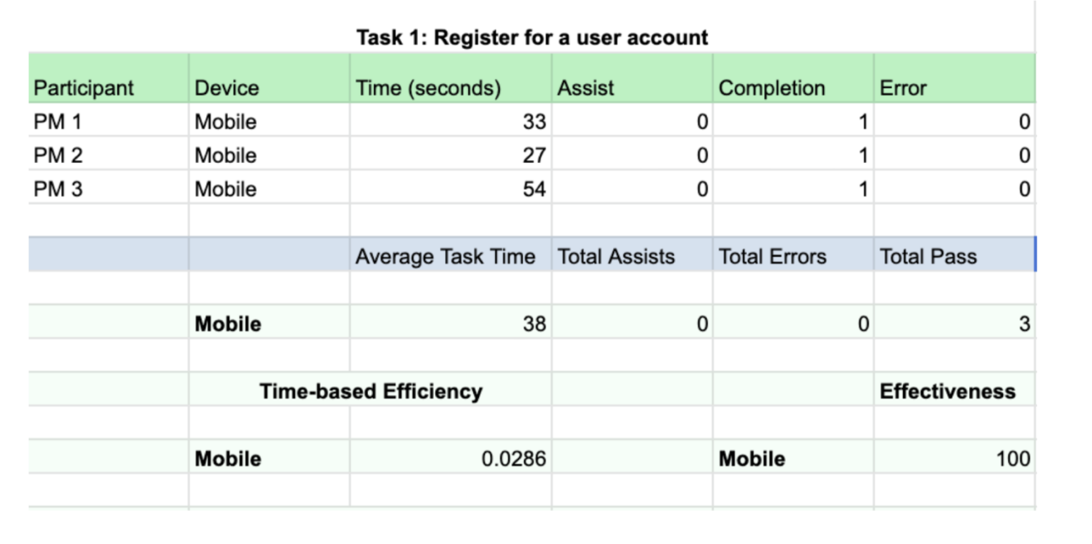
Testing surfaced a few real issues — chiefly, some users were unsure how the AR functionality worked. But the fundamentals held up strongly.
success and effectiveness on the account-registration task — no assistance, no mistakes.
average completion time — almost half the expected time, confirming sign-up was clear.
The Solution
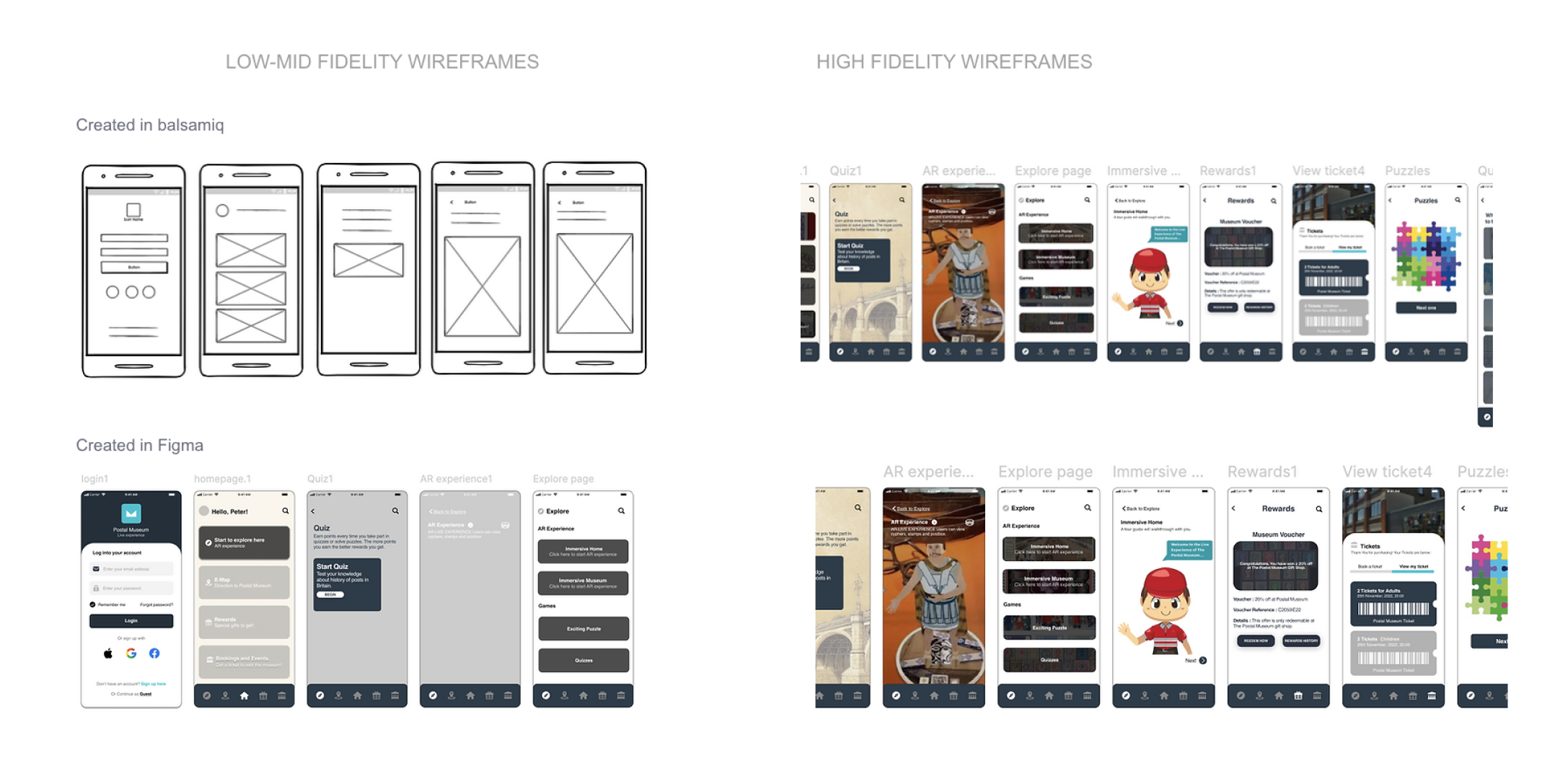
From grey boxes to a living AR tour — the design tightened at every fidelity, guided by what testing told us.
Impact
The redesign made exploring the museum more engaging — visitors stayed longer and went deeper. Beyond the numbers, the AR layer turned a one-way tour into something people wanted to interact with.
Up from 2m 15s to 2m 35s per visit.
Up from 2 pages to 3 pages per session.
TEAM & ROLE
- ClientThe Postal Museum
- Team2 UX · 2 UI · 1 Dev · 1 Game Designer
- MineResearch, UX, UI & museum visit
- Year2023
Interested in working together?
Start a Project
Startup Croydon