STARTUP
CROYDON
Room booking platform
Startup Croydon is a charity that gives early-stage founders a place to work.
I designed its room-booking experience — leading research, UX and visual design in a team of four, and taking it all the way to a shipped launch.
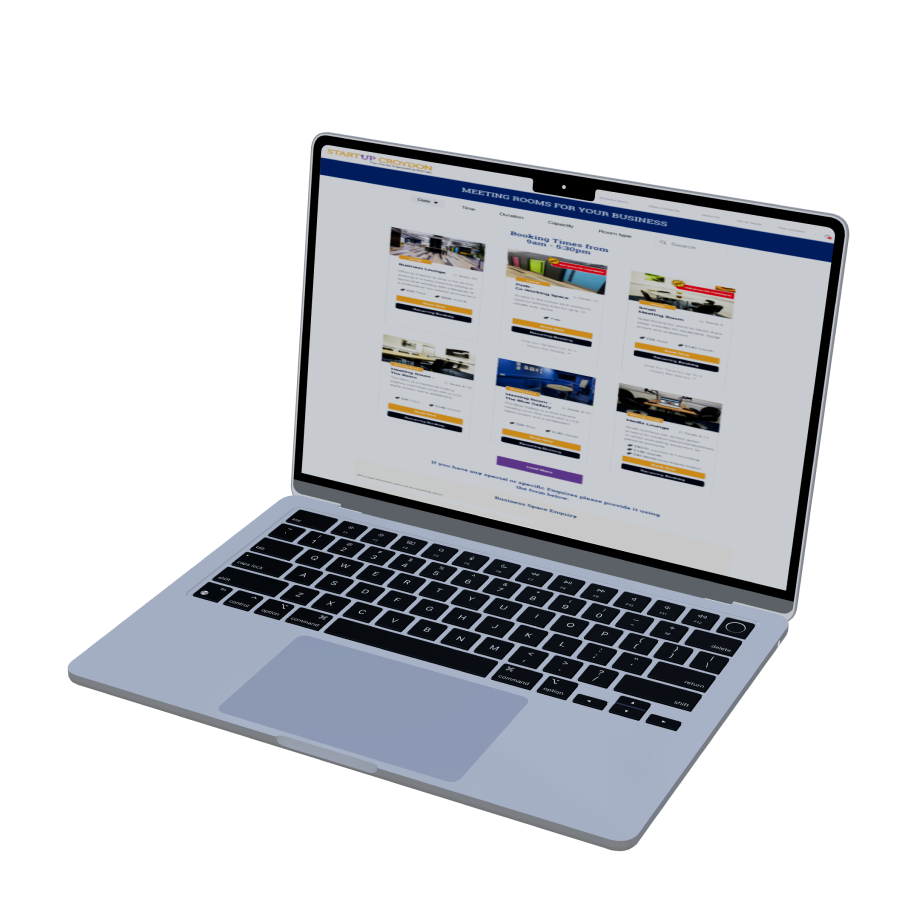
Prototyping
The Challenge
Startup Croydon rents out lounges, co-working pods and meeting rooms to the founders it supports. But its booking tool got in the way — members weren't sure which space fit their needs, or what actually happened after they hit "book."
I shadowed Sam, the facility manager, as he juggled room availability and chased confirmations by hand. The pattern was clear: the platform was doing the charity's admin work for it, but leaving members guessing. My job was to make booking a space feel as simple as reserving a desk.
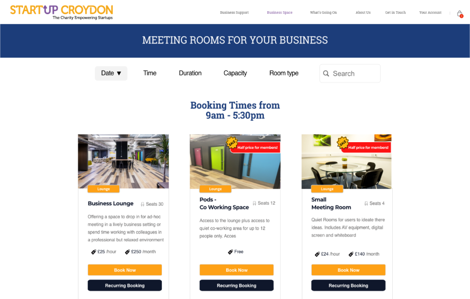
WHERE IT BROKE DOWN
Booking a space
- 01No clear starting point for first-time members
- 02Lounges, pods and meeting rooms blurred together
Managing a booking
- 01Unclear what happens once a booking is confirmed
- 02Too many steps to reach booking settings
- 03No way to see or adjust reminders for a booking

How Might We
Three questions anchored our whiteboarding — each one aimed at a moment where members were getting stuck.
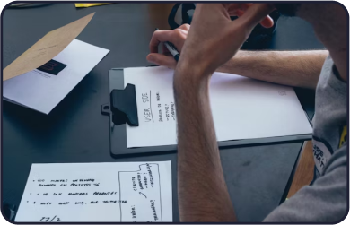
Ease of Use
How might we make booking a space effortless — even for a member doing it for the first time?

Clarity
How might we help members tell booking, modifying and managing a reservation clearly apart?
Control
How might we give members simple tools to review, adjust and stay on top of their bookings?
Research & Discovery
Competitive Analysis
01I benchmarked how leading booking tools handle availability, room types and confirmations, then mapped the patterns worth borrowing for a small charity's space-booking flow.
Usage Patterns
02Working with the data on past bookings, I pinpointed peak hours and the actions members repeat most — which told us exactly which features to prioritise.
Who We Design For
03Two people carry this product: the founder booking a room between meetings, and the facility manager keeping the calendar honest. Every decision had to serve both.
Design System
04I audited the existing UI, kept what already worked for consistency, and built new components only where clarity demanded them — nothing decorative.
Exploring Design Treatments
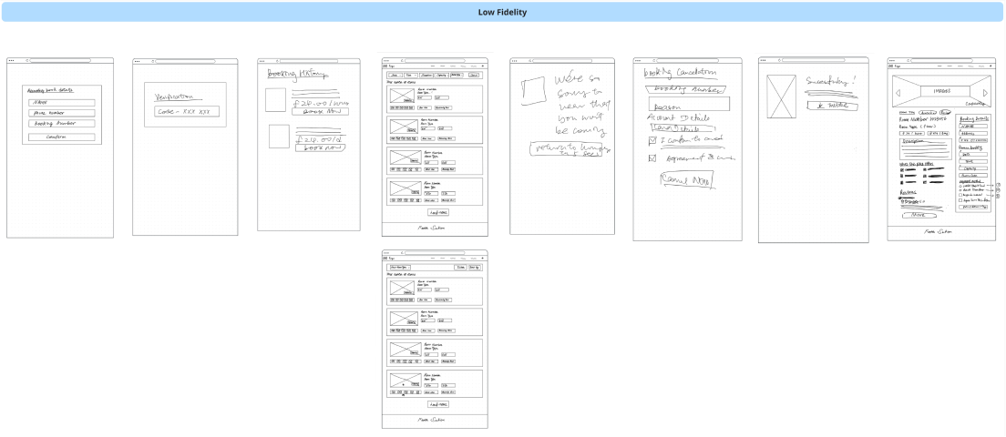
I moved fast on paper before committing pixels. Sketching the flows by hand let me test the logic of each step in critique, then validate the winners with members before building them out.

Navigating Booking Management
Members kept confusing booking a space with browsing events — two different jobs living too close together in the old flow.
So I designed one continuous path, from the moment a member is interested in a space to the point where they're managing it, with guidance surfaced exactly where it's needed.
The Solution
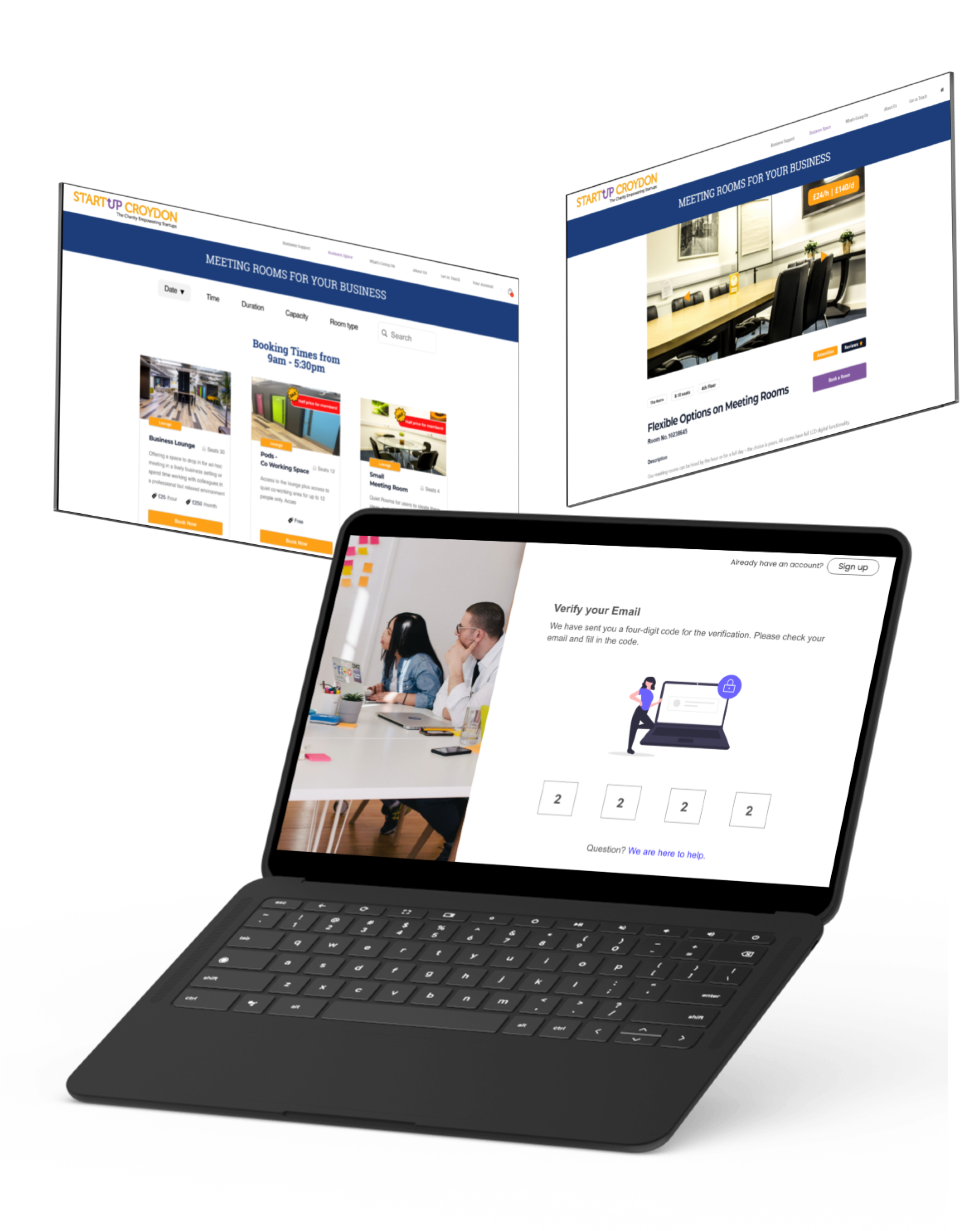
Everything a booking needs, in one place
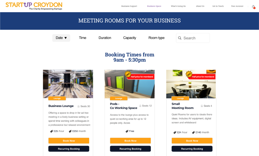
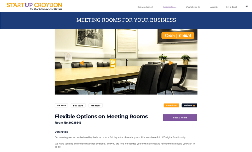
I organised the experience into three clear zones — Upcoming Bookings, Saved Spaces and Space Overview — so a member can see what they've booked, what they're considering, and what's available without hunting for it.
KEY MOMENTS
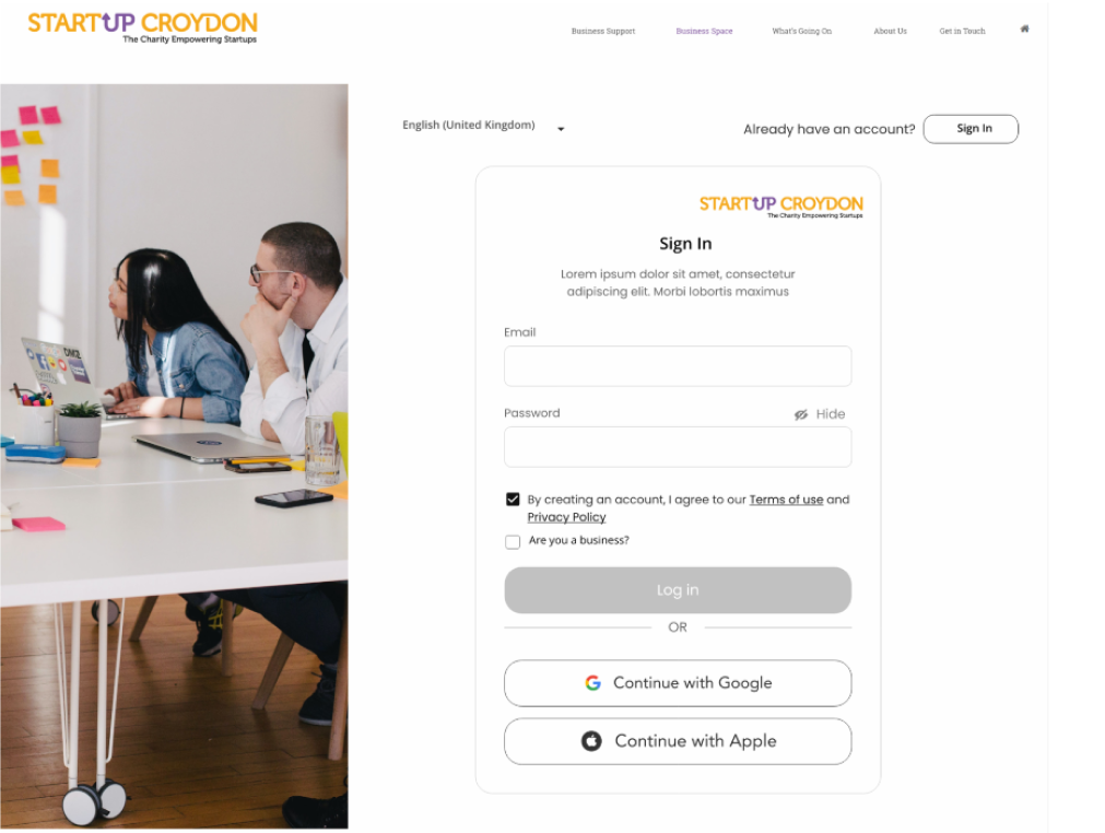
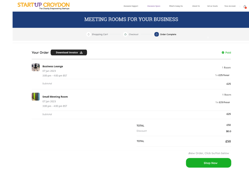
Booking at the right time
The data showed members book most between meetings — mid-morning and early afternoon. I used those windows to surface availability and gentle reminders when people were most likely to act.
Language that fits
I replaced system-speak with words members actually use — "Book a room," "Your bookings," "Saved spaces" — so the product sounds like the community it serves, not a corporate portal.
Impact
The redesigned booking platform shipped to launch — turning a confusing, admin-heavy tool into a flow members can move through on their own. Fewer questions for the facility manager, a clearer path for founders, and a product that finally sounds like the community it serves.
TEAM & ROLE
- ClientStartup Croydon
- DesignCindy Yuen · David Bolokan · Chirag · Shirkan
- MineResearch, UX, UI & prototyping
- TestingMembers & stakeholders
Interested in working together?
Start a Project

Japan Matcha